

Signify Dynalite | The Legacy Continues
Brand Refresh Reveal
Client: Signify Dynalite (In collaboration with QC Video)
Responsibilities: Art Direction, Illustration, Animation
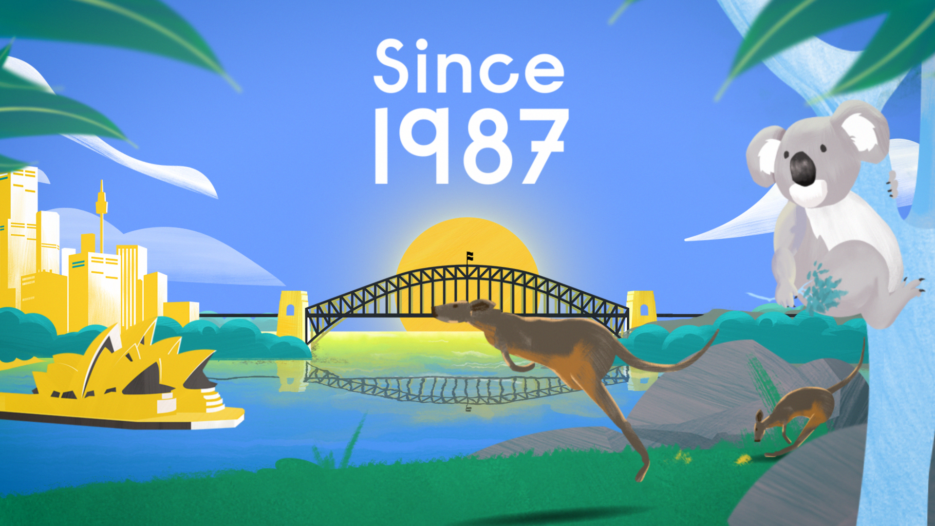
Dynalite has empowered smart buildings across the globe with its suite of connected lighting control solutions since 1987.
More than just lighting control, the Dynalite system offers all the powerful integration capabilities you need to bring your next project to life. Suitable for any project, in any industry, at any scale, this innovative system will help you to transform environments and enhance people’s lives.
The Challenge
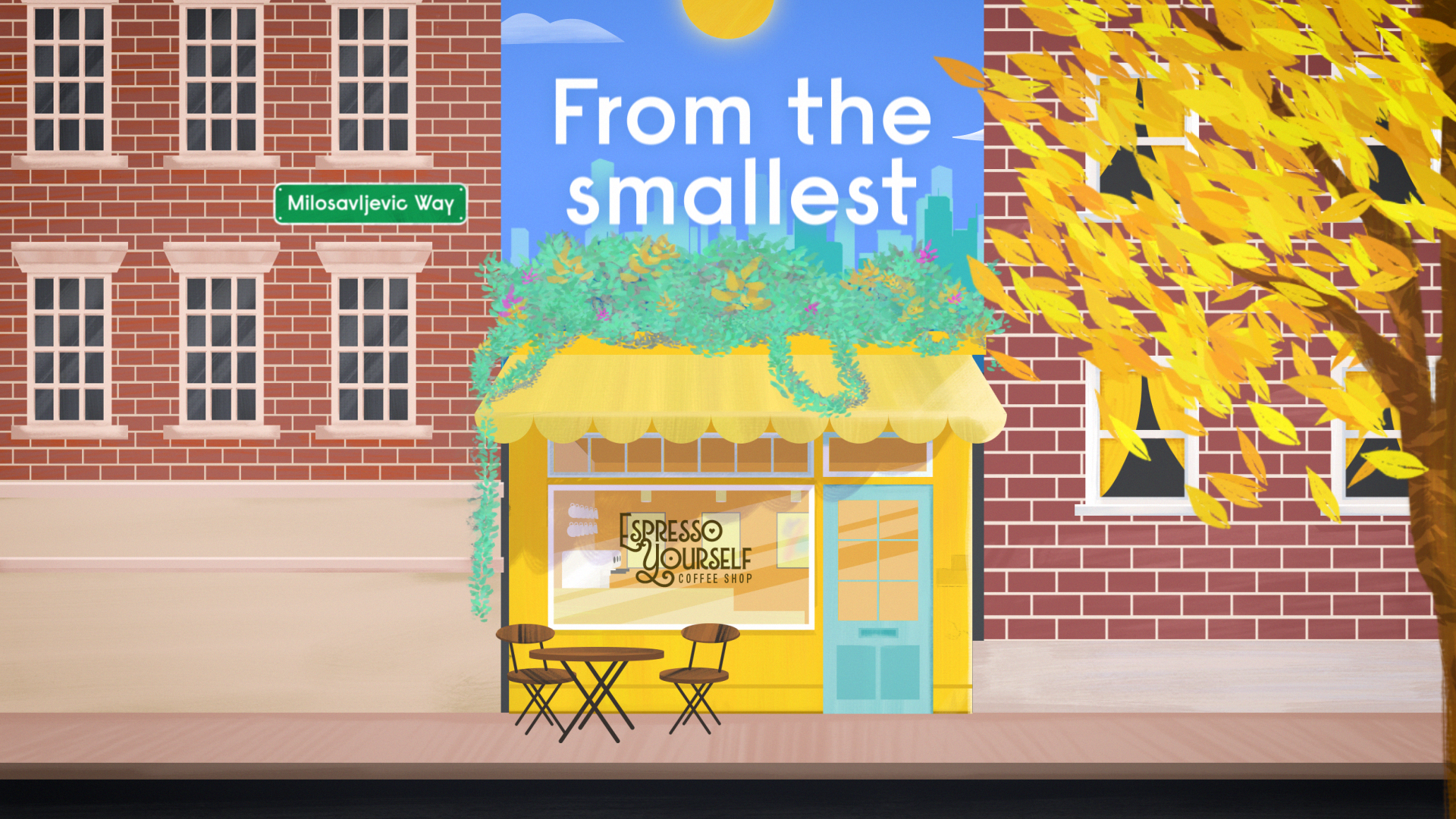
After a decade under the blue-tinted corporate guidelines of Philips, Dynalite faced a fundamental identity shift. The transition to Signify Dynalite wasn't just a rebranding; it was an opportunity to break away from corporate coldness and embrace a warm, authentic, human-centered personality.
The project required a delicate balance: introducing a new visual language that felt fun and approachable, while still honoring the brand’s Australian heritage and global reach.
The Solution
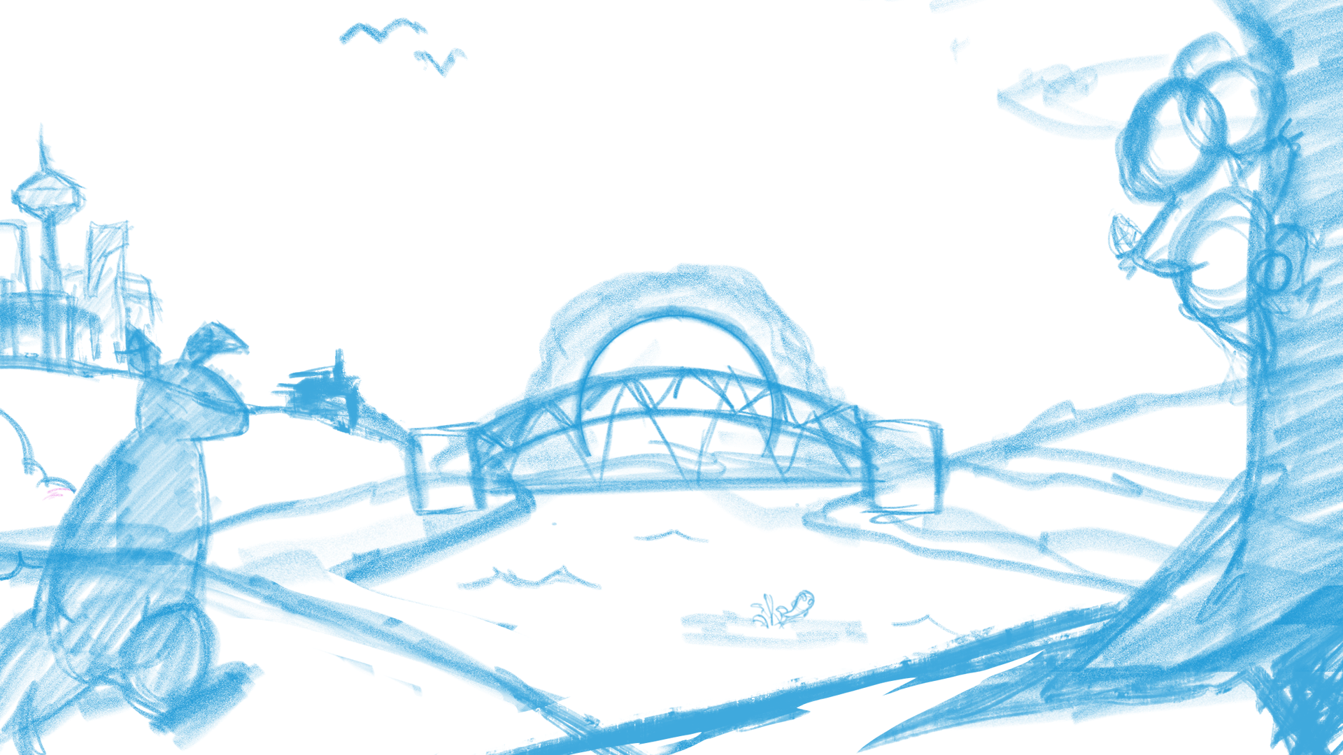
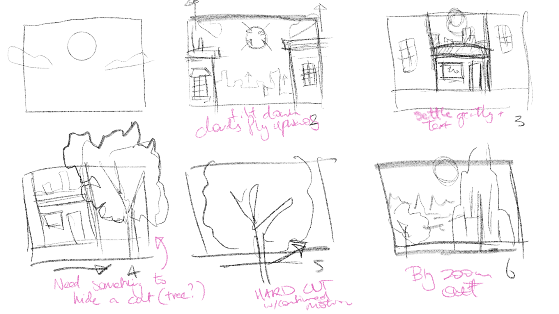
To signal this departure from their previous parent company, I moved away from sterile, traditional corporate motion design in favor of a bespoke, hand-illustrated narrative.
This one-off, artisanal approach served as a "pattern interrupt" for the brand, immediately distancing Signify Dynalite from Philips Dynalite.
By prioritising storytelling and human touch over generic vector assets, I created a brand reintroduction with genuine longevity, transforming a technical rebrand into an engaging story about the brand's evolution and its future.


The Impact
While most technical brands rely on a cold, 'high-tech' aesthetic that feels increasingly commoditized, the choice of a bespoke, hand-drawn narrative acted as a necessary pattern interrupt.
This visual shift allowed Dynalite to shed its former corporate skin and step into an identity that is authentically human and uniquely Australian.